Pycha padding present and future
Simon Ilyushchenko sent me a patch some weeks ago about tick labels in Pycha. The patch fixes the label position in the case where it goes out of the surface dimensions. The problem with his patch is that is too specific and only works well for the most simple case. For example, it doesn't solve the problem:
- when you have rotated labels
- when you have pie charts
- for the y axis tick labels
And that's why I didn't add his patch to pycha. When developing the library I always try to make it as orthogonal and predictable as possible, so if a feature is added and it should work in all places where it makes sense. Users that send me patches are not usually concerned about edge cases but that's my work as the library author and maintainer.
But the real point is that Simon raised a real issue with Pycha that I was worried about since the very beginning: right now the user has to adjust the padding options to make sure that tick labels and other things are kept inside the surface. Clearly this is suboptimal and for automatically computed charts without human intervention it can be a real issue.
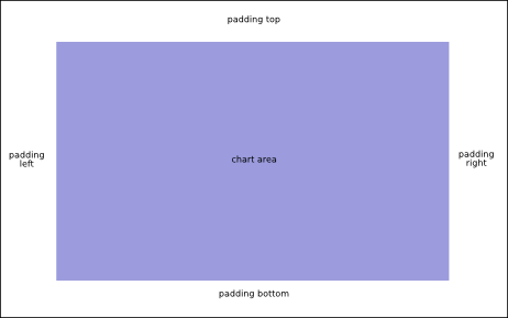
So let me explain how pycha uses its real state space right now. First, the user tells the library how big the rendering surface is going to be: let's call these parameters surface_width and surface_height. Then there are these padding options: padding.top, padding.bottom, padding.left and padding.right. Let's see it in the following figure:

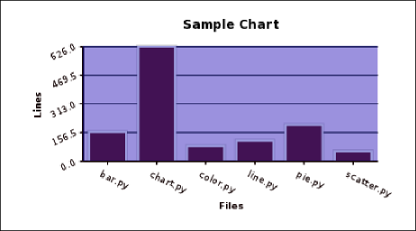
Now we have a padding area and a chart area. The chart area is where pycha draws the chart. The axis (when used) are drawn in the boundary of the chart area and the tick labels and axis titles are drawn in the padding rectangle. Other things like the chart title and the legend are also drawn in that rectangle. You can see it in the next figure where the chart area has a blue background:

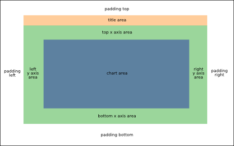
Now, I want to change this and make Pycha automatically compute all its elements so the padding is actually that, blank space. Optimally Pycha should not draw anything into the padding rectangle. Well, there maybe some exceptions, see the end of this post for more information about them. So let's define some new areas:

The goal is to make Pycha compute all these areas automatically so the chart area is reduced to accomodate all the other things the library draws in the surface without cluttering the padding area. This is a big change and it won't happen for 0.5.2 but I'll try to have it for the 0.6.0 release. Obviously this is a backwards incompatible change and new charts rendered with the same options will look smaller. Maybe I'll set the default values for the padding options to zero to minimize the update impact.
The way Pycha will compute these areas is actually pretty similar than the way graphical toolkits like Gtk+, Tk, Qt, Swing, GWT do it when using layout containers where the widgets are placed in. There is a layout phase where the area's dimensions are negociated and calculated and then there is a rendering phase when the elements/widgets are actually drawn. For bar and line charts this may look overkill but for other charts like pie charts is really the only sane way to do it.
The legend is a special case and I'm still not sure about positioning it using 'absolute' coordinates or give it its own area that is taken into account for the layout algorithm.